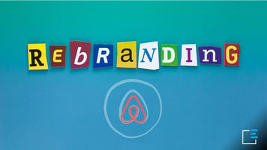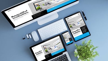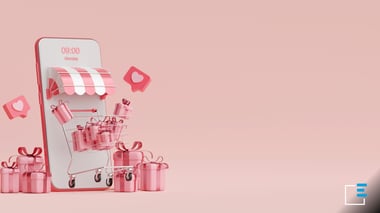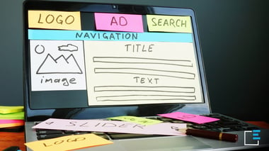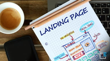
HubSpot Landing Page: how to create perfect ones
Landing Page HubSpot: why are the best?
Massimiliano Barone, the founder of Ekeria, says:

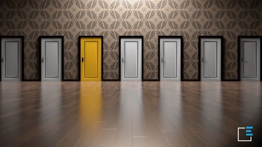
When you approach this task, you don't know where to start, a good dose of inspiration is needed, you can't make mistakes,
names are everything and they reveal the essence, the quality of what is named.
There is no pre-established path to follow, the names can be descriptive, imaginative and even suggestive.
Mi I was embarking on creating a Digital Marketing Agency, to give myself the opportunity to work on something that I'm really passionate about and to give the opportunity to many companies that, despite having an excellent product/service, are unable to achieve success which they deserve.
Ecco l’ispirazione, la parola chiave era "opportunità" anzi una “buona opportunità” che in greco antico si traduce con la parola “Eukairia", presente anche nel Nuovo Testamento.
Qualche piccola modifica per rendere il nome più pronunciabile, per avere la disponibilità di un dominio sul web... ed ecco Ekeria.
Ekeria is a "good opportunity" for me, for all the people who work there and for our customers, to grow and to reach their most ambitious goals."


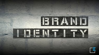
The logo is a fundamental element of the brand identity of any company. Creating it for a start-up or modifying an already existing one is not a small task and requires a certain amount of time. It must transmit its values, adapt to the historical period, it must be recognizable, versatile, simple and original.
A mix of many elements that, for the Ekeria logo, began to emerge during the market study phase and the elements of differentiation that we would have liked to have compared to our competitors.
On the first sheet of paper, says Massimiliano Barone, I started writing all the elements I wanted the logo to contain:
![]()
1. A reference of the company name;
2. The differentiators I had identified: innovation and customer care;
3. The idea of creating a working environment where people can have the freedom to experiment and carry out their own thinking;
4. Color, which was supposed to represent our creativity, the ability to make things happen and inspire trust;
5. The font: without serifs, simple, which speaks of digital, according to the principle "less is more".
The first sketch, drafted in pencil on a page in a journal, was followed by many others, looking for that image that could communicate all those things in a simple way.
The Ekeria logo is an "E" that wants to break the mold to experiment with new things, "out of the box", in search of continuous improvement, in a path of maximum growth focused on innovation and customer care.

Contact
Digital Tips